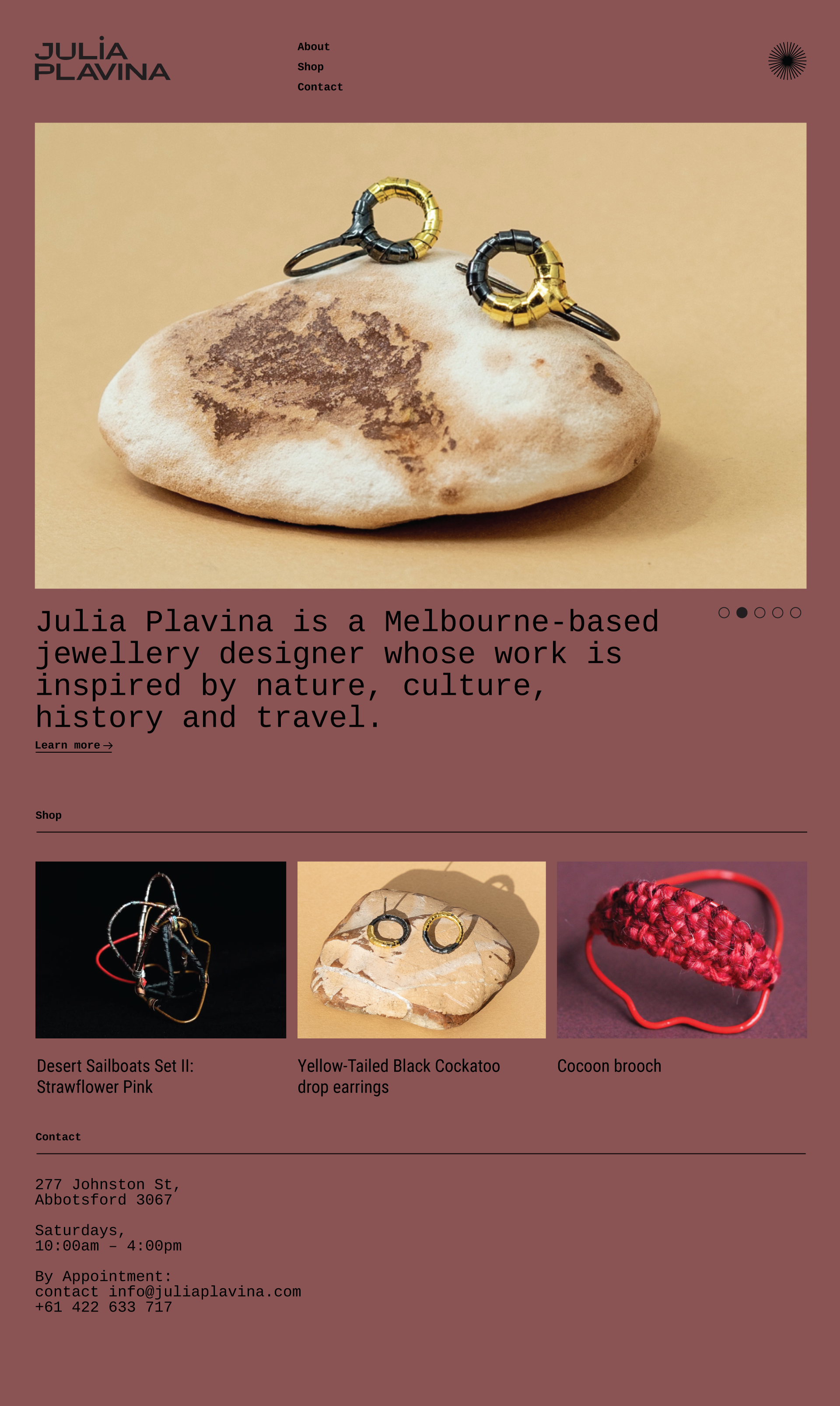
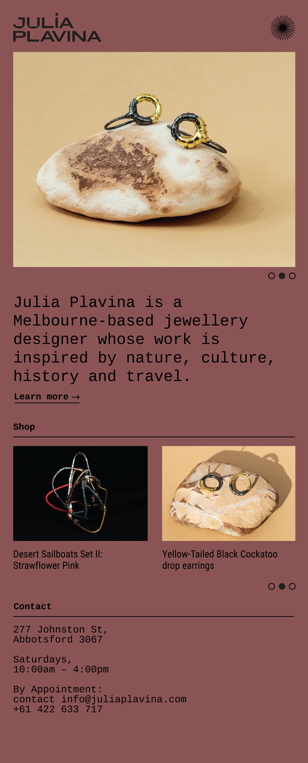
Julia Plavina is a Melbourne–based jewellery designer whose work draws on nature, travel, history and 1970s folk influences. She works by weaving, bending, soldering and stitching materials including alpaca wool, silver, gold, shibuichi, cotton and stone.
I was engaged to design her logo and business cards, with additional concepts for a website and packaging system.
The Approach
The starting point was the maker’s hand — the physical act of weaving and stitching that defines Julia’s process.
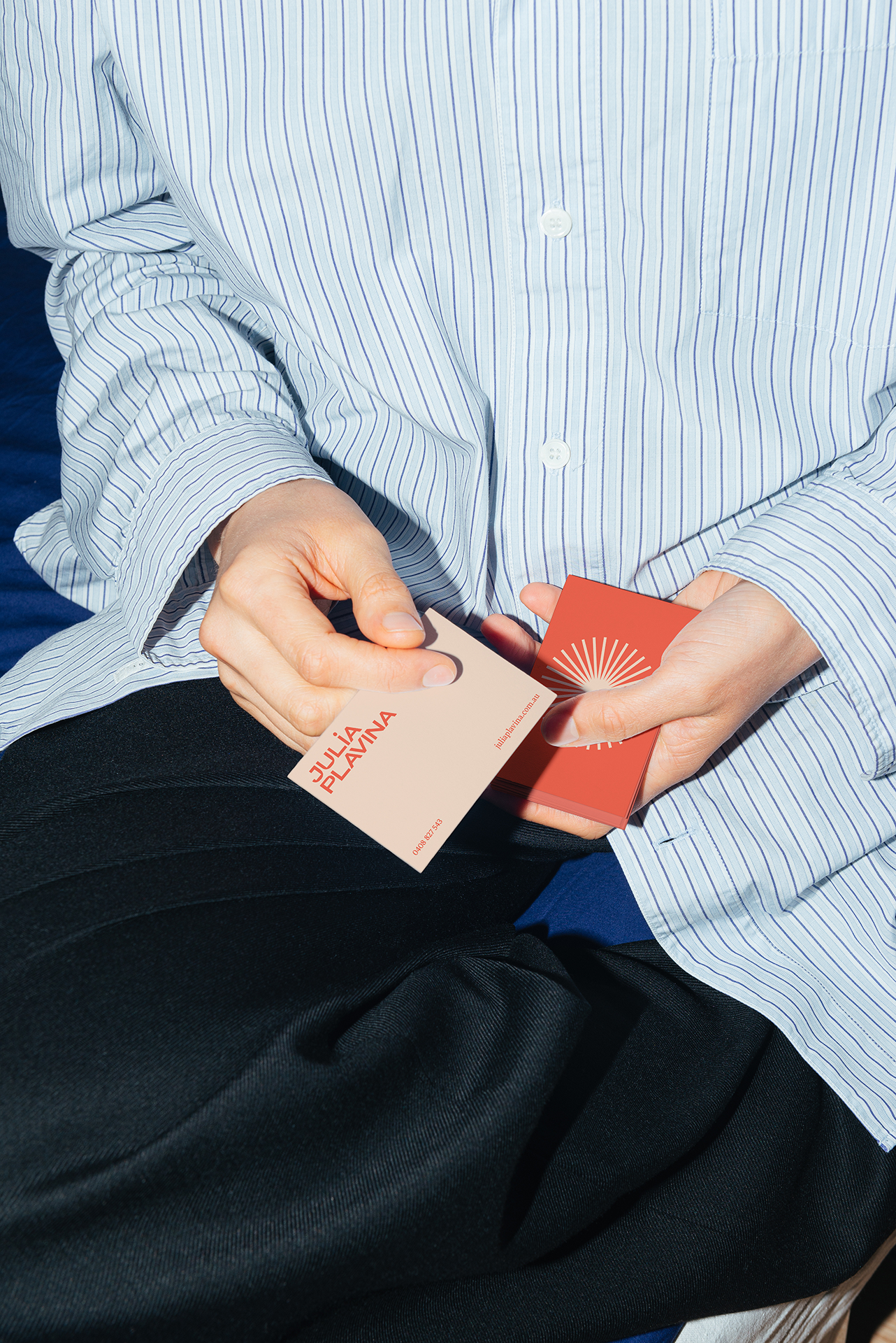
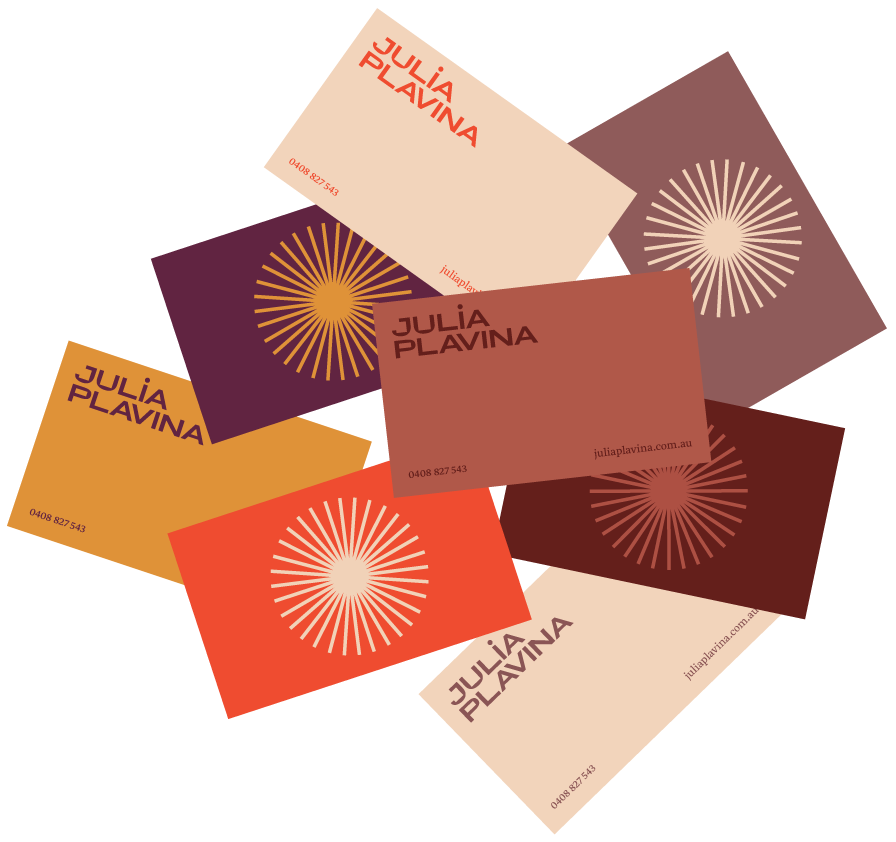
I introduced a subtle “stitch” motif into the typography by squaring the curves of the J, U and P, creating a mark that feels structured yet handmade. The chosen typeface is wide and contemporary, with a quiet nod to 1970s design — reflecting Julia’s references without feeling literal.
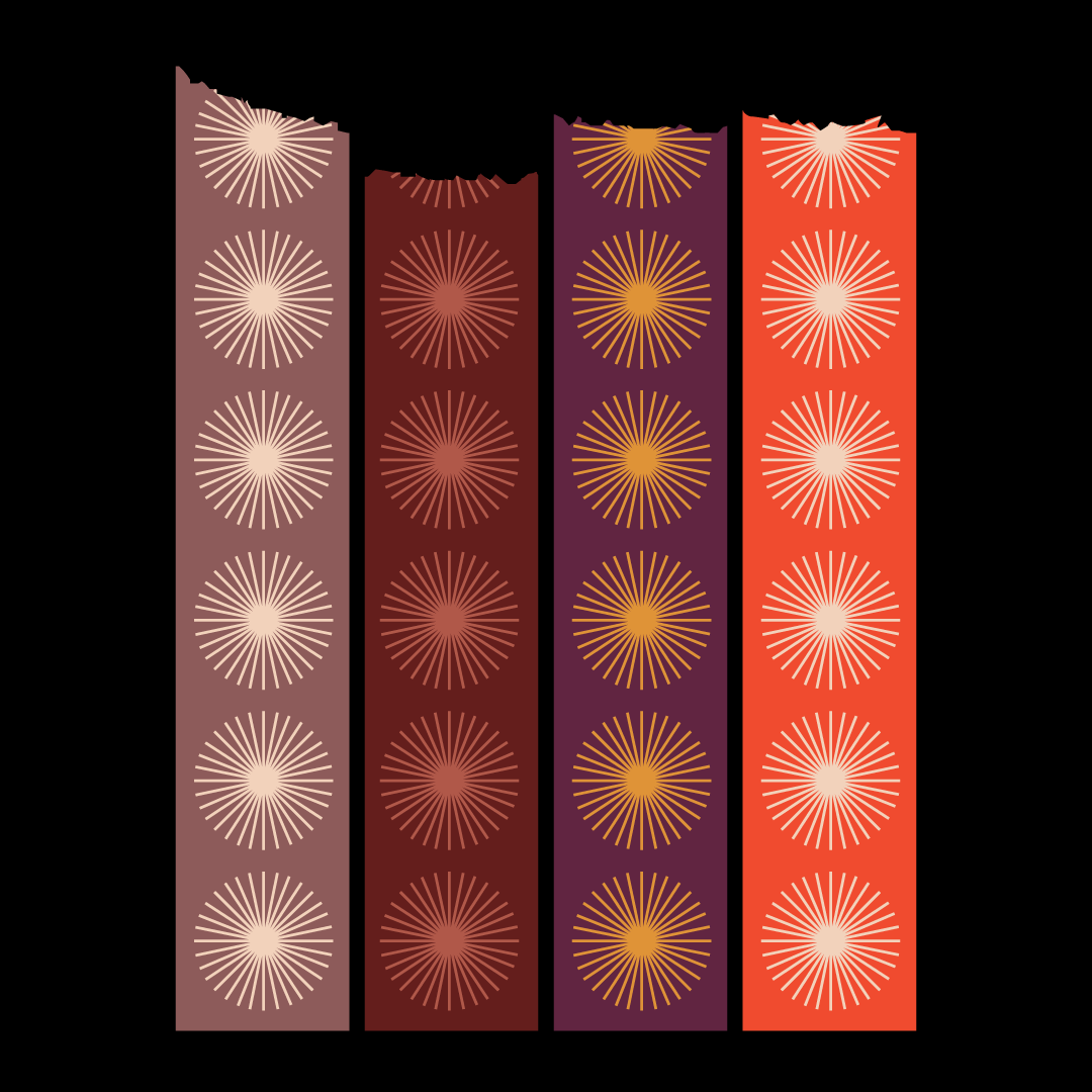
A secondary stitch symbol was developed to function as a standalone icon across applications, from business cards to social media.
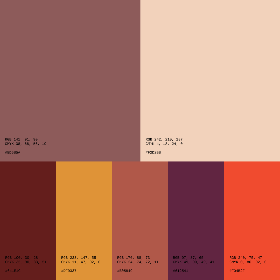
The colour palette draws directly from the materials in Julia’s work — earthy, mineral and varied — allowing flexibility while maintaining cohesion.
For packaging, I proposed a cost-effective system using custom washi tape applied to plain boxes, ensuring the brand could scale without excess production costs.
Deliverables
- Primary logo and maker’s mark variation
- Secondary stitch icon
- Colour palette system
- Business cards
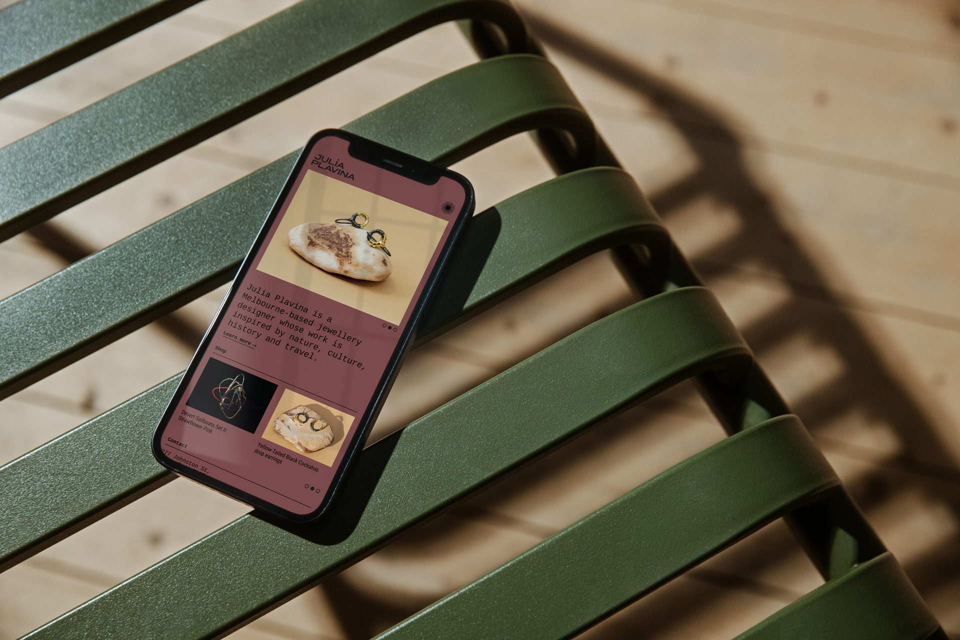
- Website concept
- Packaging concept (custom washi tape system)
Outcome
The identity and business cards were implemented and are still in use today, including across Julia’s Shopify website.
Despite the initial ambiguity around the brief, the final brand feels cohesive and expressive — a clear visual extension of Julia’s craft.
Reflection
I’m particularly proud of how harmoniously the system holds together. It balances structure with warmth, and feels authentic to Julia’s process without overpowering her work