As part of Grimshaw’s work with the University of Melbourne, I designed the visual framework for a comprehensive guideline document outlining principles for the future Fishermans Bend campus — a new precinct focused on engineering, technology and advanced research.
The publication needed to communicate complex spatial ideas and design principles clearly while reinforcing the ambitious, forward-thinking nature of the project.
The Challenge
The guideline outlined conceptual approaches to designing an entirely new university campus — covering ideas around experimentation, collaboration, and research culture. The challenge was to create a design system that communicated these ideas clearly while maintaining a strong sense of structure and authority.
Because the document functioned as a set of guiding principles — effectively an instruction manual for shaping the future campus — the design needed to feel robust, legible and practical while still engaging visually.
My Role
- Developed the overall visual identity and layout system for the publication
- Designed a flexible InDesign template with structured chapters, introductory sections and case study pages
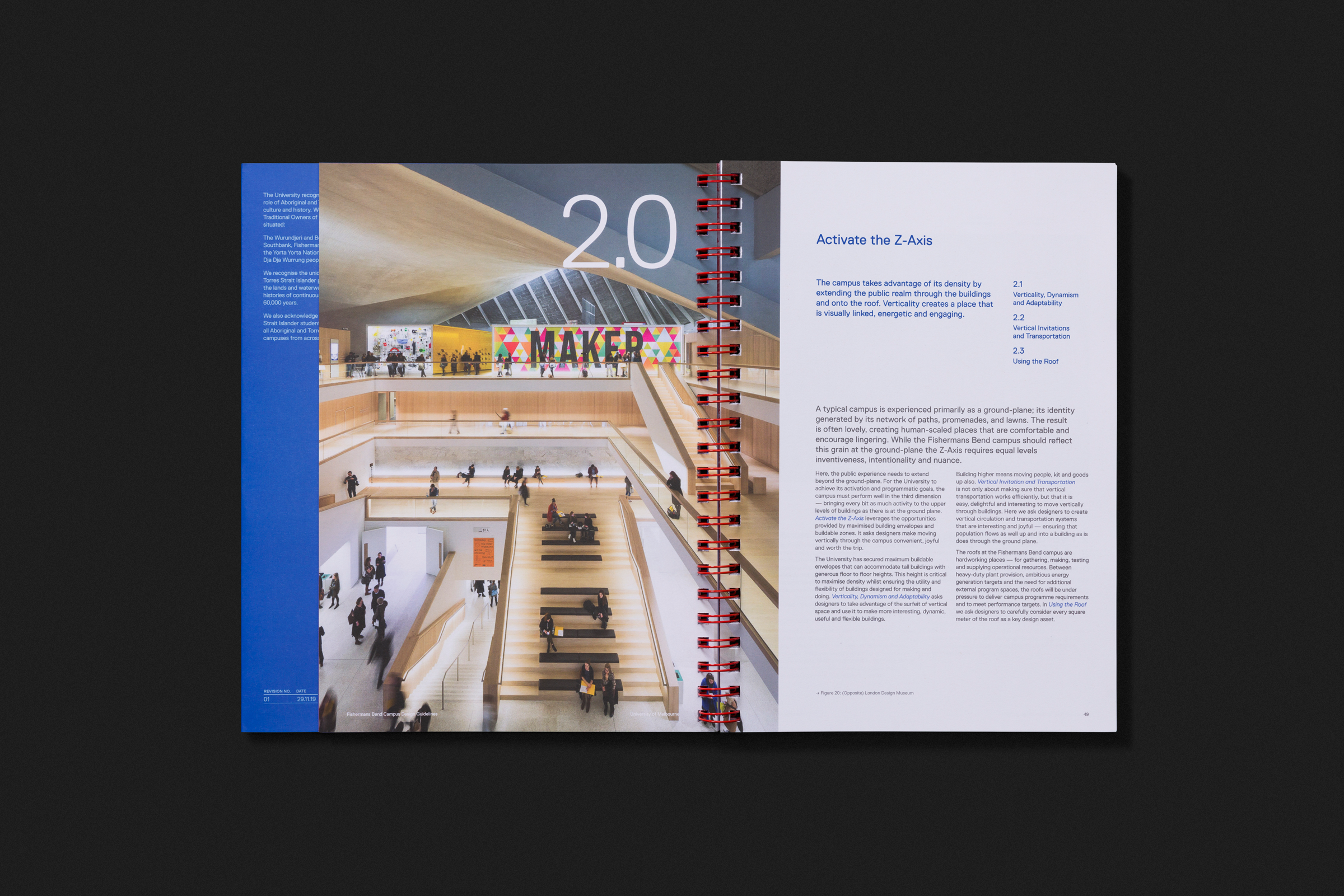
- Established a clear typographic hierarchy using bold headings and simple layouts to support readability
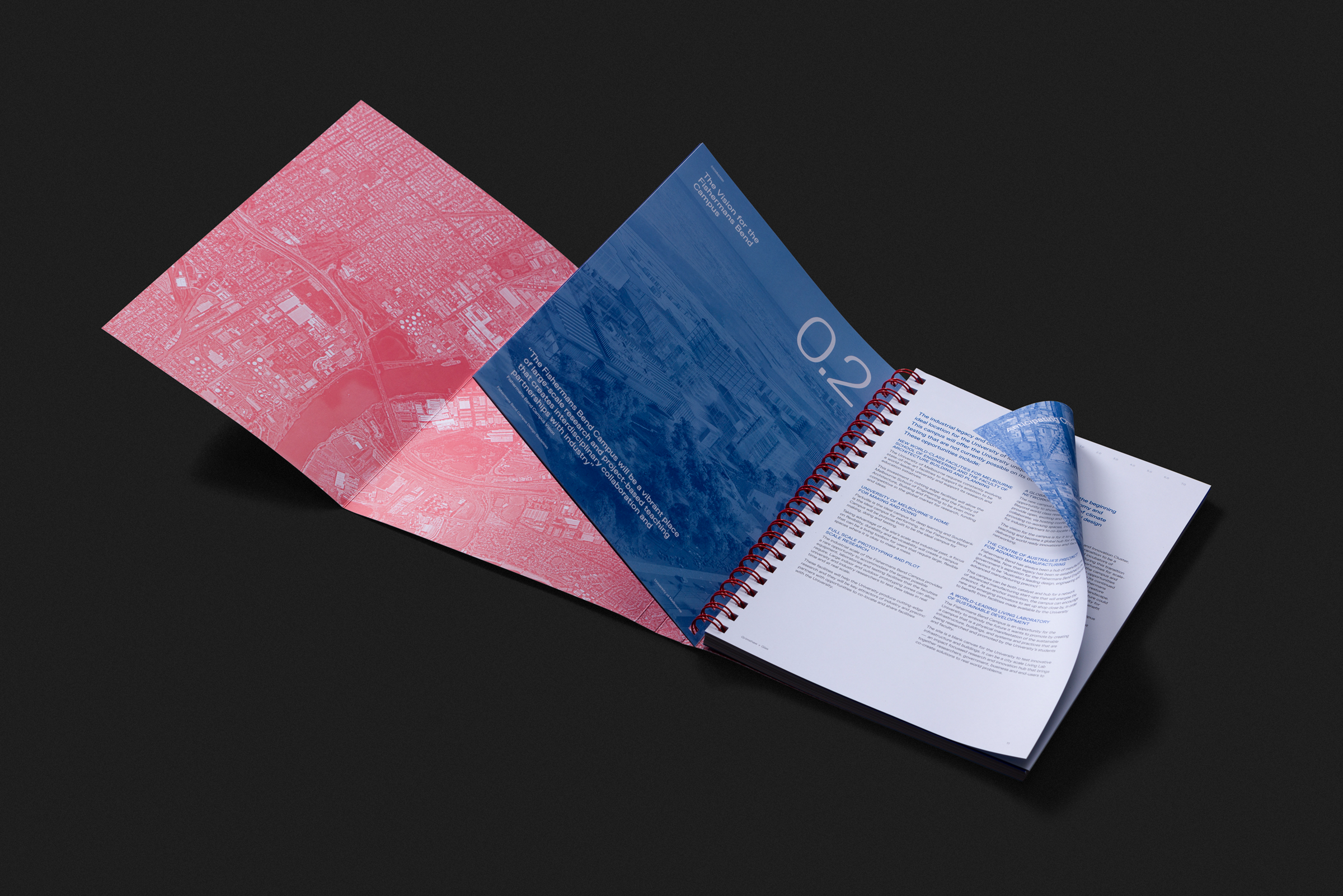
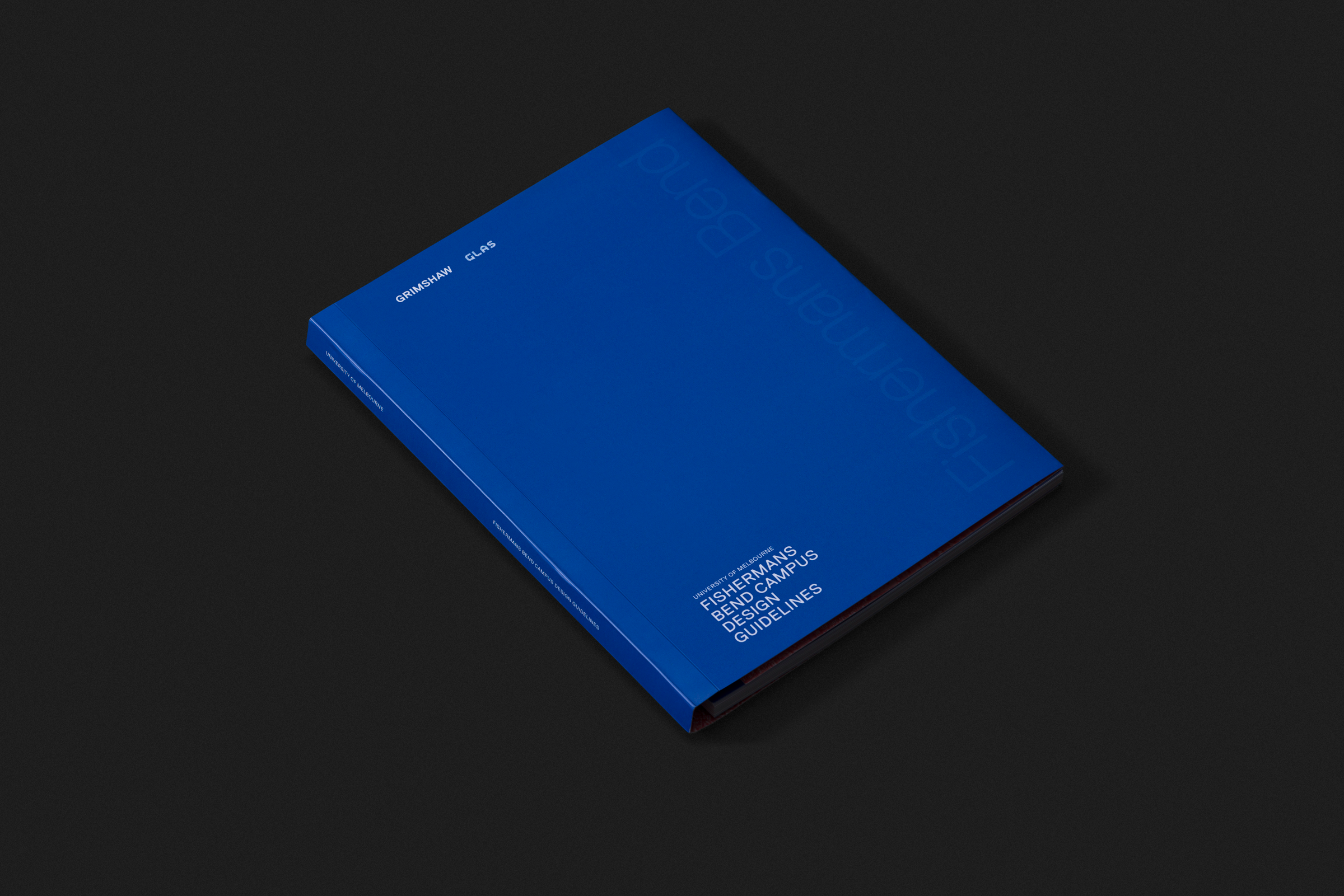
- Created a restrained colour palette centred on blue (referencing the University of Melbourne brand) and red accents
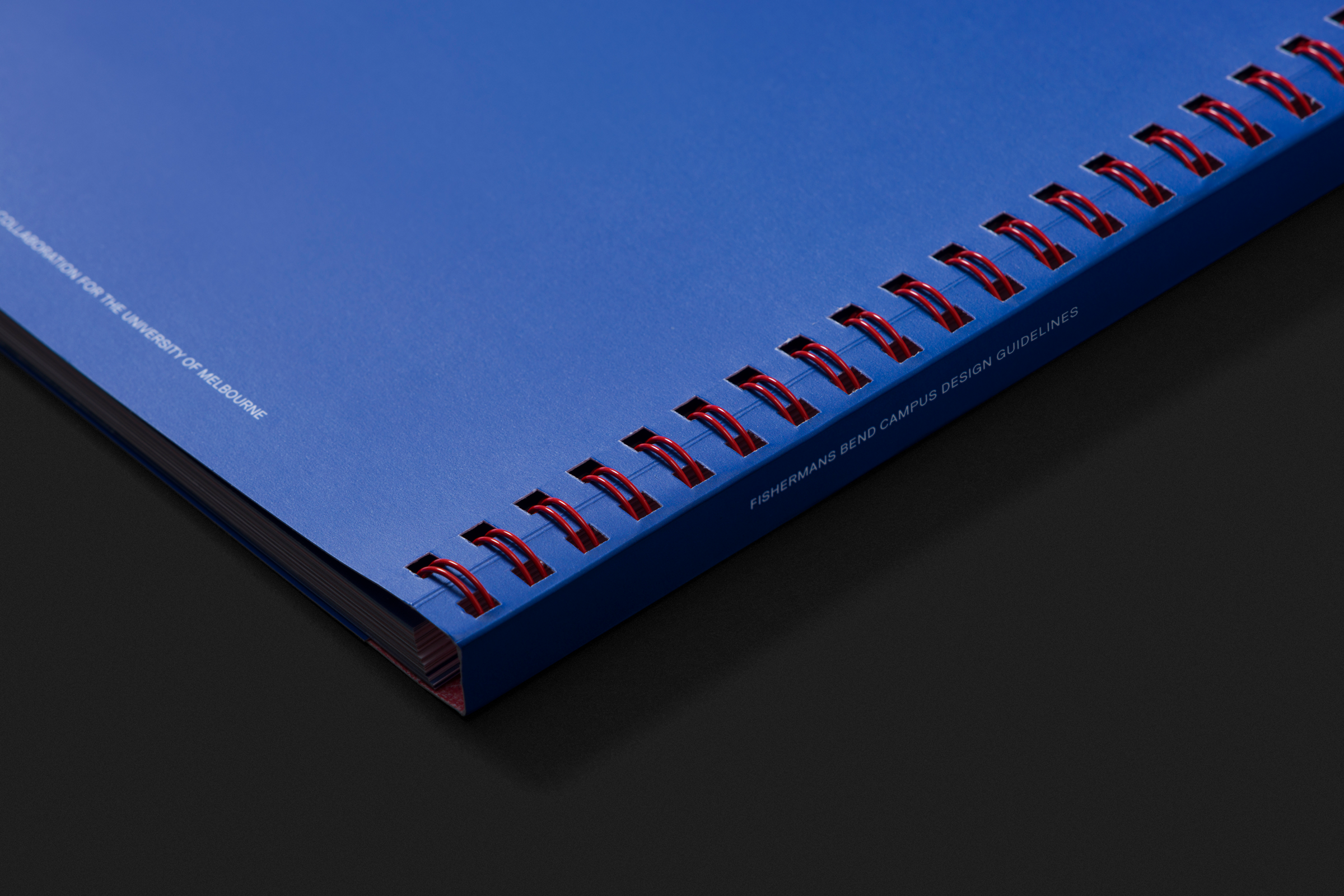
- Designed the printed edition with a Canadian binding system (wire binding with a wraparound cover)
The Approach
The design language was informed directly by the purpose of the document. As the publication functioned as a set of design instructions for building a university campus, I approached it as a type of instruction manual.
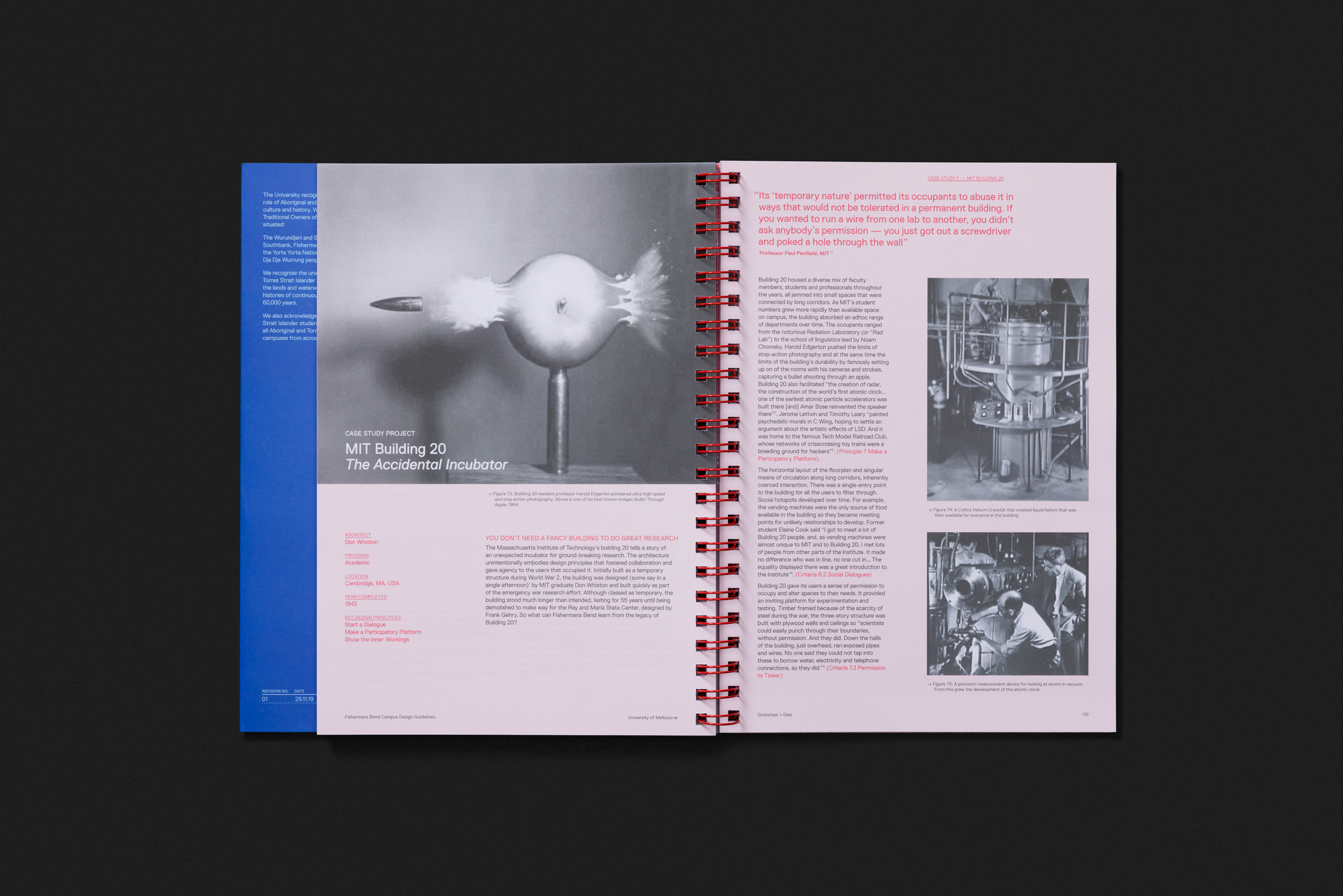
Layouts were deliberately simple, structured and robust. Large, bold typography and generous spacing helped guide the reader through conceptual material, while diagrams produced by the architectural team and supporting case studies — including the famously experimental MIT Building 20 — provided visual rhythm and depth.
This instructional logic also extended to the physical book design. For Grimshaw’s internal library copy, I designed a wraparound cover with Canadian binding, where a visible spiral spine is enclosed within the cover. The red spiral binding tied into the colour palette while reinforcing the publication’s industrial, practical character. Although spiral binding is rarely associated with luxury publications, in this context it felt purposeful — resourceful, utilitarian and aligned with the culture of experimentation central to the campus vision.
Deliverables
- Visual concept and layout design
- Full document template system
- Typography and colour framework
- Layout of key pages and sections
- Print-ready artwork and internal library edition
Outcome
The template enabled the project team to efficiently assemble and refine the guideline document while maintaining a consistent visual language throughout. The final publication clearly communicated the conceptual framework behind the Fishermans Bend campus and served as a structured reference for future design work.
Reflection
I’m particularly proud of how the design embraces the idea of the publication as a working manual — balancing clarity, structure and visual character in a way that supports the ambitious thinking behind the project.